Optimizing Web Development: Typography
Strategies we use to style typography more predictably and consistently throughout a website.
Developing websites involves seemingly countless areas of expertise. From the planning steps, to hands-on development, to long-term maintenance, all stages are highly involved and require deep thinking. It benefits everyone, then, to optimize each step of the way.
In this article, I outline several strategies we use at Wall-to-Wall to optimize typography styling on the web. While it may seem like a tiny part of the puzzle, creating a system around such an elemental part of a website frees up one’s brain to focus on other, more important parts.
1. Encapsulate typography styles
Ensure your typography styles are not affected by other classes. This means not defining global text styles such as sizes, weights, and margins1.
When a design calls for a specific type style, it should be as easy as adding a class name or defining a property. If surrounding elements affect the typography, you may immediately need to reverse those effects. What should take a single declaration now requires overrides specific to that location of the element tree. In another part of the page, you may need to provide a different set of overrides if styles are not properly encapsulated.
CSS practices like Atomic CSS are a great way to encapsulate styles . Because atomic CSS styles generally do not target child elements, each element can be styled independently of their location.
Takeaways
- Don’t use global text styles1.
- Selecting a typography style should be as easy as adding a class or property.
- Use CSS practices like Atomic CSS to ensure parent styles don’t affect typography.
2. Create a consistent API across styles
Websites will generally make use of multiple typography styles, such as different font families and sizes. Selecting a particular style from a collection of predefined styles should be effortless.
As discussed in the previous section, implementing a style should be as easy as
adding a class name or property. On top of that, moving between styles should
require minimal effort. For example, if a heading is using a class name called
.heading-1, all other heading styles should follow a similar convention, like
.heading-2, .heading-3, etc. Changing styles now just requires changing the
number suffix.
Furthermore, if the style names are kept in a specific order and naming scheme,
discoverability and design flexibility becomes easier. If .heading-1 defines
the largest font size, for example, then .heading-2 could be the next size
down. If an in-progress design looks awkward with a large font size, we
intuitively know we can move from .heading-1 to .heading-2 without needing
to reference documentation.
Takeaways
- Moving between typography styles should be effortless.
- Plan style names ahead of time using a convention.
- Try to keep an order among style names.
3. Use optical bounds
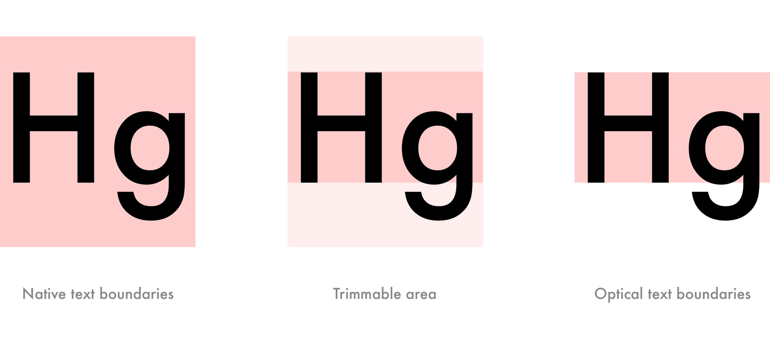
Browsers add a varying amount of whitespace above and below the outline of characters, making space styling somewhat of a guessing game. Use styling techniques to remove the extra whitespace to make spacing more predictably and consistent.

Tools like Capsize and Basekick automate some of the work for you. Capsize, for example, can read a font file and convert it to a set of metrics. It then uses those metrics to remove the extra whitespace above and below a block of text through clever use of negative margins.
Removing the guesswork out of implementing specific spacing requirements results in a more consistent final product. It also reduces the cognitive overhead to style typography properly by treating spacing just like every other HTML element.
Takeaways
- Remove the extra whitespace around text.
- Use tools to automate the process.
- Treating text like other elements reduces cognitive load.
4. Make an easily accessible style guide
Create a reference of all available typography styles to be used by designers and developers. This makes it easy to compare and select styles as needed. It also reduces the chance of someone adding a duplicate, or very similar, style.
Such a style guide should be easily accessible and usable. It can act as a palette of typography styles while developing components of a site, just like a painter uses a palette of paints. The more accessible the guide is, the more likely a designer or developer will use it.
A style guide not only aids in the initial development of a site, but also in future developments. A style guide helps ensure website additions and changes stay within the original design specifications. And when the design specifications eventually evolve, a style guide makes it easier to track and plan site-wide design changes.
Takeaways
- Create a reference of typography styles.
- Ensure the reference is easy to access and use.
- Use and evolve the guide over the lifetime of the website.
How does Wall-to-Wall treat web typography?
These strategies have been developed based on real-world experience. By embracing these strategies, we have seen long-term maintenance of client websites becoming more efficient and easily scalable to future projects.
In a follow-up article, we’ll describe how we implement the strategies listed above using a combination of React and various JavaScript libraries.
-
Global CSS resets or normalizers are okay (and encouraged!) as they effectively remove styles, not add, at the base-level.
↩
